Examples of painting works. Creative works. Useful techniques for working with the palette
1st year students of the specialty “Painting”
for independent homework on still life painting
List of homework
in still life painting
Exercise 1. Still life of household items using grisaille technique
Exercise 2. Still life of household items in color.
Exercise 3. Still life of household items similar in color
Exercise 4. Still life of household items, contrasting colors
Exercise 5. Still life of white objects.
Exercise 6. Still life in the interior.
Exercise 7. Still life in the open air.
Explanatory note
In the painting curriculum for 1st year students of the Painting specialty, a significant place is devoted to still life: 36 hours in the 1st semester and 132 hours in the 2nd semester. Another 50% of this time is devoted to independent homework. Sequential development of still lifes is provided, starting with simple full-scale settings and ending with complex thematic still lifes. In productions composed of everyday objects, problems related to the study of chiaroscuro and the tonal solution of form, color relationships and coloring are solved, that is, those means of expression that the artist uses when creating a work.
Simple, clear geometric shapes that underlie the study of still life provide an opportunity for 1st year students to become familiar with the means and methods of constructing a three-dimensional image on a plane in connection with the environment.
Mastering the technique of watercolor painting is a mandatory requirement of the program for the 1st year. Watercolor has great visual potential, is convenient and efficient, and allows the use of a variety of technical techniques.
Both in classroom practical classes and in independent homework, special attention is paid to acquiring knowledge and skills in constructing a form, the ability to see and convey the varied state of nature depending on lighting conditions and the correct methodological sequence of working on still life painting.
When performing a still life sketch, the number of stages is determined by the complexity of the full-scale setting, however, the main stages are considered to be the following:
1) compositional placement of the image of the entire group and individual objects on the plane of the sheet;
2) linear constructive solution of the form, taking into account their proportions, movement and spatial position;
3) determination of the overall color tone; transfer of general large tonal and color relationships, proportional to nature;
4) modeling the volumetric shape of objects, identifying gradations of light and shade and their pictorial elaboration, taking into account aerial perspective;
5) a generalizing stage of work on completing the sketch; identifying the main and secondary elements in the color structure of the sketch; subordination of all parts of the image to the whole.
A cycle of homework on still life painting, in close connection with homework on drawing and composition, leads to the development of artistic observation, imaginative thinking, creative imagination, sense of color and color relationships.
Ultimately, students should acquire a solid knowledge of still life painting necessary for independent work.
Download:
Preview:
To use the preview, create a Google account and log in to it: https://accounts.google.com
On the topic: methodological developments, presentations and notes
METHODOLOGICAL RECOMMENDATIONS FOR ORGANIZING INDEPENDENT WORK OF STUDENTS WHILE STUDYING THE DISCIPLINE “Children's literature of the country of the language being studied” (Specialty 050144.52 Preschool education)
Methodological recommendations for organizing independent work of students according to MDK.02.02 “Technology for developing and protecting databases”
Methodological recommendations for organizing independent work of students
The article will help you plan students’ independent work using the proposed table for individual work....
Methodological recommendations for organizing independent work of students MDK 01.07 Additional teacher training. education in the field of musical activity: musical instrument (piano) “Algorithms for working on piano works of various
Methodological recommendations for organizing independent work of students MDK 01.07 Additional teacher training. education in the field of musical activity: musical instrument (piano) “Algorithms for working on basic technical formulas, exercise
Methodological recommendations for organizing independent work of students in the academic discipline “Economic Theory” for students of the specialty 38.02.01 Economics and Accounting (by industry)
Extracurricular independent work of students is the planned educational, educational and research work of students, carried out during extracurricular time according to instructions...
there are answers to all these questions. Here are the basics of where to start painting. Follow these tips, do the exercises and you will no longer be afraid of a blank slate. You will receive the necessary knowledge and basic skills. Painting will become closer, clearer and will bring a lot of pleasure.
Part 1. Preparatory
1. Find an inspiring subject to draw
It happens that you have already prepared everything, but you cannot find an object that would inspire you. This should be taken care of in advance. Something interesting is probably lying around in cabinets and desk drawers. Look for items at estate sales, consignment stores and grocery stores. Study paintings by your favorite artists.
The selection should include items that are pleasant to look at: this is important for creating successful work.
An interest in color and shape will motivate you as you work on your painting. There is a connection between feelings for an object and the ability to reveal your abilities. You can do more than you think.
For the first picture, a simple one-color symmetrical vessel, such as a regular coffee cup, will do. Illustration from the book
2. Get to know brushes and paints
Take a soft round brush and a bristle brush in your hands and compare their bristles. Squeeze some acrylic paint from the tube onto the palette. Try applying undiluted paint with different brushes to canvas or watercolor paper. The strokes should be bright and bold. Feel the differences in strokes with different brushes. Add a little water and apply the strokes again. Medium consistency paint has the same color intensity as undiluted paint, but its texture is smoothed out. And do this exercise again with a weak paint solution. Notice how quickly the paints dry the first, second, and third times.


Illustration from the book
Try applying paint with different brushes - soft oval, synthetic thin, bristly flat. Try each brush until you are confident that you know which brush to use to achieve the design you have in mind.

Illustration from the book
3. Useful techniques for working with the palette
The colors in the paintings we see are usually obtained through mixing: the pure color from the tube is usually too intense. These techniques will make it easier for you to get the color you want.
- 1 Squeeze the paint from the tube onto the edge of the palette, leaving space between the colors. Use the center of the palette for mixing. Make batches farther apart to prevent unwanted mixing.
- Apply pure color to the brush from the edge of the palette, and not from above or from the middle of the squeezed out “sausage”.
- Intense dark colors such as black (although it is not scientifically considered a color) should be added with caution; even a small amount can significantly change the color being mixed.
- You need to mix the colors together until the mixture becomes completely homogeneous.
- Don't skimp on the paint. Squeeze out as much as you need - usually this is a circle the size of a ruble coin (for whitewash - the size of a five-ruble coin). Paint consumption is an integral part of the painting process. If you save too much, you will never learn how to use paint.
4. Learn to get neutral colors
In any picture there are neutral colors - “visually gray”. Due to their low intensity, they are invisible at first glance, but they are the most useful tool for creating a harmonious color composition. Let's see how to achieve this.
Mix blue and orange in any proportion. Now let's try to change the color temperature by proportionally warm and cool colors in the mixture. If the result is more purple, try making a rusty color by adding more orange paint and then whitewash for a lighter peach color. If the first step produces a rusty color, add blue to create a cool color, close to purple, and then white to create a light violet-gray.
Repeat the previous steps for another pair of complementary colors - yellow and purple, red and green.

Pairs of complementary colors are connected by short vertical strokes. The colors of each pair are mixed with each other to create two neutral colors, each of which was dominated by one of the parent colors - these are located to the right of the corresponding parent. Illustration from the book
5. Primary, secondary and tertiary colors
Draw a circle, then divide it into three equal sectors. Paint the upper sector with cadmium yellow medium, the lower right one with ultramarine blue, and then mix the main red from naphthol crimson and cadmium red light and paint the lower left sector with it.
On the color wheel of primary colors, draw semicircles with centers at the intersection of the sector boundaries with the outer contour of the color wheel. Fill these semicircles with secondary colors, placing them above the “parents”: cadmium red light above the border between red and yellow, dioxazine violet above the border between red and blue. Add yellow to the green FC and fill in the green semicircle above the border between yellow and blue.
The primary color, when mixed with the adjacent secondary color, produces a tertiary color. Add one triangle on each side of the semicircle, making six in total. Color in each triangle based on the labels.

Primary, secondary and tertiary colors. Illustration from the book
Part 2. Drawing
6. Start with abstractions
Abstraction is an interesting and simple way to prepare for working on a realistic piece. It is important to choose 3-4 colors that you like in order to feel an emotional connection with the painting. Draw a continuous angular or rounded line over the entire surface of the sheet with a simple pencil. It may intersect several times.
Paint the shapes in the drawing with the colors and shades, paint consistency and brush that you like. Listen to your inner voice. The main task is to do it the way you like, forgetting about everything else.

Illustration from the book
7. Smear pattern
Beginners are often unsure how to apply strokes. The arrows in the figure show the direction that will help to achieve good depth in the depicted space using the example of a mug.


Smear diagram and result. Illustration from the book
8. How to apply eye shadow
Shadows play a key role in creating a three-dimensional image: first of all, you need to learn to see and write them. There are four types of shadows:
- Own shadows located on objects. These are areas of dark tone that contrast with the illuminated parts of the depicted form. They usually have a sharp edge at the outer edge and a smooth transition at the edge of the light-colored areas of the subject. They play the main role in creating volume.
- Halftone areas- narrow, with a soft contour, located on the border between its own shadow and the illuminated area of the object. These shadows are the middle tone between the contrasting dark and light tones of the subject.
- Falling shadows- silhouettes of an object, “fallen” or thrown by it onto any surface other than itself. They give the impression that the object is on some surface.
- T Eni at the point of contact- the darkest area of the falling shadow, lying next to the object. They are responsible for the “stability” and mass of the object. These shadows are also called the accent - the darkest area among the dark tones. An accent is the dark counterpart of a highlight, the lightest area among the highlights.
To paint a shadow, apply black paint or paint of a darker color than the base color. And in the second step, cover this darkened area with the main color. The halftone black should show through under the new coat of paint, creating a colored shadow. If you want to make the shadow darker, apply more black from the clear edge of the shadow and mix with the color in the midtone.

Shadow using the example of a cylinder. Illustration from the book
9. How to apply highlights
To create a realistic highlight, use a dry brush with white paint to paint the lightest area on the subject as many times as necessary to achieve sufficient brightness. In the middle of the highlight, place a small dab of thick paint for extra brightness.


Two examples of highlight overlay. Illustration from the book
10. Paint pictures in your imagination
While going about your daily activities, paint pictures in your imagination. Mentally look for correspondence between the surfaces and textures you see around you and the way you work with a brush and apply paint.

- If you have experience in pencil, you can safely start learning to paint;
- If you have zero experience, then first we recommend that you take a Basic course at a painting school for adults. After completing this course, it will be much easier for you to practice painting;
- If you have serious experience in drawing with pencil and paints, you can begin, under the guidance of an experienced teacher, to create your own portrait, copy masters, or develop your own ideas.
Painting works
 |
 |
 |
|
| Natalia Kudryavtseva 3 months of training (oil); |
Nastya Khokhlova 3 months of training (pastel) |
5 months training (oil) |
Nastya Trosnova about 6 months of training (pastel) |
 |
 |
-s.jpg) |
| Elya Grudina (12 years old) 6 months training (oil) |
Katya Popova (16 years old) 8 months training (oil) |
Tanya Nigai (24 years old) 7 months training (oil) |
 |
 |
 |
| Elena Orlova about 2 years of study (watercolor) |
Valya Shvets (27 years old) 4 months of training (pastel) |
Valya Shvets (27 years old) 8 months of training (pastel) |
Graphic arts
The individual approach used in the Art-Idea studio assumes that the teacher works with you based on your goals and needs. In this regard, you can improve in any drawing technique that interests you, be it thin and transparent watercolor or a more pasty technique of oil painting. Also at the painting school for adults you can get acquainted with the most delicate pastel technique, glossy gouache technique, matte tempera or dry brush technique.At the Art-Idea school, adults and children can study painting.
School of painting
Works done with a palette knife
 |
 |
 |
Coming to painting school, we usually assume that we will be drawing on a piece of paper and using a brush! This is our usual idea. Interesting fact: The Italian school of painting does not recommend the use of brushes for a beginning artist. At first, they learn to depict something in general and only with a palette knife. The brush diverts attention towards little things that are not yet needed at an early stage of learning.
 |
 |
 |
Learning colors is a lot of fun! You've probably heard that different colors have different effects on people. So red color can excite, and blue calms, yellow brings joy, and green brings harmony. In the life of a modern person, there is often a lack of pure bright colors, hence the depressed mood and despondency. Painting training in this sense, it is healing for most people, adding vibration and harmony to their lives of those colors that they are missing! There is even such a direction - art therapy, where people are treated with the help of color. Thus, painting often harmonizes not only the soul, but also the human body!
Painting training passes into Studios No. 1(m. sq. Vosstaniya) or Studios No. 2(metro Prosveshcheniya Ave. or metro Grazhdansky Ave.)
the past fascinates with its colors, the play of light and shadow, the appropriateness of each accent, the general condition, and flavor. But what we see now in galleries, preserved to this day, differs from what the author’s contemporaries saw. Oil painting tends to change over time, this is influenced by the selection of paints, execution technique, finishing coat of the work and storage conditions. This does not take into account minor mistakes that a talented master could make when experimenting with new methods. For this reason, the impression of the paintings and the description of their appearance may differ over the years.
Technique of the old masters
The oil painting technique gives a huge advantage in work: a picture can be painted for years, gradually modeling the shape and painting in details with thin layers of paint (glaze). Therefore, corpus painting, where they immediately try to give completeness to the picture, is not typical for the classical manner of working with oil. A thoughtful step-by-step approach to applying paint allows you to achieve amazing shades and effects, since each previous layer is visible through the next one when glazing.
The Flemish method, which Leonardo da Vinci loved to use, consisted of the following steps:
- The drawing was painted in one color on a light ground, with sepia for the outline and main shadows.
- Then a thin underpainting was done with volume sculpting.
- The final stage was several glaze layers of reflections and detailing.

But over time, Leonardo’s dark brown writing, despite the thin layer, began to show through the colorful image, which led to the darkening of the picture in the shadows. In the base layer he often used burnt umber, yellow ochre, Prussian blue, cadmium yellow and burnt sienna. His final application of paint was so subtle that it was impossible to detect. Own developed sfumato method (shading) allowed this to be done with ease. Its secret is in heavily diluted paint and working with a dry brush.
 Rembrandt – Night Watch
 Rubens, Velazquez and Titian worked in the Italian method. It is characterized by the following stages of work:
- Applying colored primer to the canvas (with the addition of some pigment);
- Transferring the outline of the drawing onto the ground with chalk or charcoal and fixing it with suitable paint.
- The underpainting, dense in places, especially in the illuminated areas of the image, and completely absent in places, left the color of the ground.
- Final work in 1 or 2 steps with semi-glazes, less often with thin glazes. Rembrandt's ball of painting layers could reach a centimeter in thickness, but this is rather an exception.
In this technique, particular importance was given to the use of overlapping complementary colors, which made it possible to neutralize the saturated soil in places. For example, red primer could be leveled out with a gray-green underpainting. Work with this technique was faster than with the Flemish method, which was more popular with customers. But the wrong choice of the color of the primer and the colors of the final layer could ruin the painting.

Coloring of the picture
To achieve harmony in a painting, they use the full power of reflexes and complementary colors. There are also such small tricks as using a colored primer, as is common in the Italian method, or coating the painting with varnish with pigment.
Colored primers can be adhesive, emulsion and oil. The latter are a pasty layer of oil paint of the required color. If a white base gives a glowing effect, then a dark one gives depth to the colors.
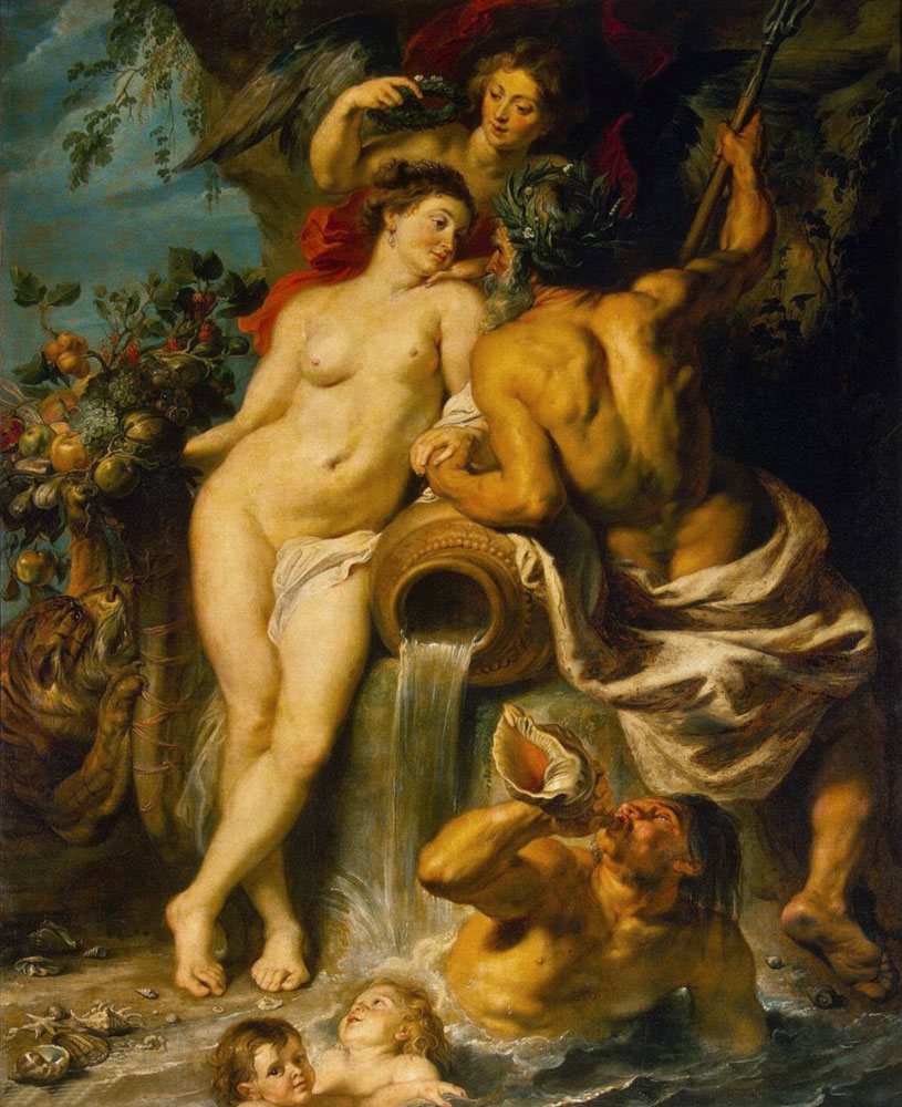 Rubens – Union of Earth and Water
 Rembrandt painted on a dark gray ground, Bryullov painted on a base with umber pigment, Ivanov tinted his canvases with yellow ocher, Rubens used English red and umber pigments, Borovikovsky preferred gray ground for portraits, and Levitsky preferred gray-green. Darkening of the canvas awaited everyone who used earthen colors in abundance (sienna, umber, dark ocher).
 Boucher – delicate colors of light blue and pink shades
 For those who make copies of paintings by great artists in digital format, this resource will be of interest, where web palettes of artists are presented.
Varnish coating
In addition to earthen paints, which darken over time, resin-based coating varnishes (rosin, copal, amber) also change the lightness of the painting, giving it yellow tints. To artificially make the canvas look antique, ocher pigment or any other similar pigment is specially added to the varnish. But severe darkening is more likely to be caused by excess oil in the work. It can also lead to cracks. Although such the craquelure effect is often associated with working with half-damp paint, which is unacceptable for oil painting: they paint only on a dried or still damp layer, otherwise it is necessary to scrape it off and paint over it again.
 Bryullov – The Last Day of Pompeii 1
The article discusses some issues of working with watercolors in painting classes. Watercolor is attractive for its accessibility and purity of color relationships. Despite the apparent simplicity of the work, watercolor is a complex easel painting technique. Particular attention is paid to materials, tools, and technological aspects of watercolor painting: glazing, “alla prima,” and “raw” methods. When working on long studies, the first one is more often used. For painting en plein air, in quick sketches, the “alla prima” method is more suitable. It is necessary to understand that mastering the skill of watercolor painting is not learned from books. Everything is learned through long-term practical work and personal experience. Therefore, practice is the best method of mastering the technique of watercolor painting.
tools
painting materials
writing method
watercolor painting
1. Beda G.V. Basics of visual literacy: Drawing. Painting. Composition. Ed. 2nd, revised and additional M.: Education, - 1981. - 239 p.
2. Vasiliev A.A. Still life painting: watercolor: Textbook. Benefit. Ed. 3rd, revised and additional Krasnodar: Kuban State Publishing House. University, 2004. - 98 p.
3. Volkov Yu.V. Working on painting sketches. M.: Education, 1984. - 31 p.
4. Skripnikova E.V. Still life: composition, drawing, painting: textbook / E.V. Skripnikova, A.I. Sukharev, N.P. Golovacheva, G.S. Baymukhanov. – Omsk: Omsk State Pedagogical University Publishing House, 2015. - 150 p.
5. Skripnikova E.V., Golovacheva N.P., Sukharev A.I. Still life painting: A tutorial. – Omsk: BOUDPO “IROOO”, 2015. - 92 p.
6. Shchetinin I.D. Watercolor: A Practical Guide. Kurgan: Publishing house "FORT DIALOGUE - KURGAN", 2009. - 31 p.
Formulation of the problemWatercolor technique is studied by students at the art faculties of pedagogical universities in the first year. In painting classes, students are given not only painting tasks: finding the general color of the setting, color-tone relationships between objects and background, conveying the volume of objects in certain lighting conditions, studying the laws and rules of aerial perspective, but also composition and drawing. Firstly, the task is to learn how to compose a production: determine the proportions of the sheet format, find the size of the image in it, place objects on the pictorial plane relative to each other. Secondly, learn to understand and draw objects of various designs and shapes, taking into account the angle and horizon line, study the laws and rules of linear perspective. In our article we consider only issues of watercolor painting technology: materials, tools, various technological techniques.
Watercolor is attractive for its accessibility and purity of color relationships. Despite the apparent simplicity of the work, watercolor is a complex easel painting technique. To master and understand it, you need to carefully study the materials and tools (paint, paper, brushes). After all, this is where any creative process begins.
Watercolor (from lat. aqua- “water”) - paints diluted with water, and in a professional artistic environment - works of painting made with such paints. The color pigments used to make watercolor paints are the same as those used in other paints. But the watercolor pigment is extremely finely ground, brought to a state where, while in water, it does not settle to the bottom for a long time. Glue - the binding substance of this pigment - must dissolve in water, be colorless, and elastic. Various plant adhesives (gum arabic, dextrin, cherry glue, honey, etc.) are used as a binder in watercolor paints; they also contain a plasticizer in the form of glycerin. Glycerin prevents the paint from becoming brittle and drying out, as it retains moisture. Sometimes ox bile is added to watercolors so that it lays easily on the paper surface and does not roll off during writing, and an antiseptic (phenol) that prevents the destruction of paint from mold.
Watercolor paints easily dissolve in water, can be washed off and provide a transparent layer that does not interfere with the reflection of light from the paper. But some paints are more transparent (carmine, scarlet, emerald green, etc.), they dissolve more completely in water and lie more evenly on paper. Others (cadmium yellow, lemon, etc.) have density and “covering power”, forming surface coatings.
It is better to store watercolor paints in a cool place, out of direct sunlight, so that they do not harden due to dry air.
Modern industry produces watercolor paints in a wide range. And, no matter how rich the palette of colors, they would not be enough to convey the variety of colors of the world around us. The artist expands the color palette by mixing paints, both mechanically and optically - by applying one layer of paint to another. It is necessary to study the properties of various paints, check their covering capabilities, color and light fastness. It is necessary to try out all possible combinations of paints, both individually and in mixtures with each other; understand what makes the “dirt” in mixtures, and what shades you should pay attention to.
“Pure” watercolor painting is painting with paints without the use of white. Since watercolor paints are transparent, the paper itself (less often cardboard) serves as the “whitewash”. Paper for watercolor painting is made in different grades in terms of density and texture. The color, density, and texture of paper are of great importance. The best paper for watercolors is thick paper with a grainy surface that is well glued and bleached. There are varieties from fine-grained to coarse in texture, reminiscent of burlap. The texture contributes to the depth of color, makes it possible for watercolor paint to easily lie on the surface of the sheet in even and transparent layers, and retain moisture in the pores longer. This paper can be used for many hours of sketches, and it also allows you to wash away bad spots. Paints do not adhere well to paper with a smooth surface and are easily washed off with a brush when applying subsequent layers; it is difficult to carry out a long sketch on it.
The uniform distribution of watercolor paint on the surface of the paper is hampered by the presence of grease stains. Therefore, before painting, the paper must be washed with distilled water using a few drops of ammonia. Yellowed paper can be bleached by washing it with a swab soaked in hydrogen peroxide.
During work, you should take care of the whiteness of the paper in bright places (glare, white surfaces of objects, etc.). To preserve light areas, you can scrape the recorded areas with a razor blade, a knife, and on a damp surface, with the handle of a brush. Another way is to cover the saved highlights and highlights with rubber cement. After finishing work on the sketch, the glue can be easily removed with a soft pencil eraser.
The color of the paper is the background, always participating in the construction of the color of the entire picture. A good paper for watercolor painting is paper that has a high level of whiteness, since its surface reflects light well through layers of paint and gives them brightness, revealing nuances of tone. Pre-tinting white paper is also used in watercolor painting. Tinted paper unifies the painting and creates a coloristic foundation for the sketch. Its tone depends on the tasks the artist solves. In watercolors, paper is often tinted with coffee or chicory decoctions of varying strengths. Tea gives beautiful shades.
To prevent the paper from warping from moisture, it must be glued to the tablet. Moistened paper is placed on the tablet, which is secured on top with a frame. When dry, the paper stretches evenly and does not warp. To keep the paper moist for a longer time, you can place damp material underneath it. For small sizes of watercolor paper, you can use an eraser. An eraser is a tablet of a certain size and a larger frame surrounding it.
In the plein air it is convenient to work on so-called gluings. Gluing is a stack of sheets with thick cardboard or plywood at the base. Sheets of paper glued together at the ends form a block. The used top sheet is removed, revealing a new one for work.
Watercolorists have traditionally used squirrel, kolin and bristle brushes, but these days there are good synthetic hair brushes available. These brushes are practical to use, their hair is not inferior to kolinsky brushes, and they have increased wear resistance and greater durability. They can be either round or flat in shape. In watercolors, round brushes are most commonly used. Kolinsky brushes are considered the best; they are more durable and elastic, and wrinkle less. The quality of the brush is checked in this way. The brush is dipped into water, then, after removing it from the water, it is shaken. If the tip of the brush is sharp, then the brush is considered suitable for work.
To paint with watercolors, you need to have brushes of different sizes (from No. 8 to No. 16). The large round brush is the main tool in watercolor painting. It can be used to apply large volumes of paint or write with the tip of a brush. At first, you can make do with a large brush, with which the artist works freely and widely, in large relationships. As experience in working with watercolors accumulates and educational and creative tasks become more complex, the artist must expand his set of brushes.
The palette is of great importance when working with watercolors. The palette should be pure white. To prevent the paint from being absorbed, the palette must be hard, even and smooth. They use a palette made of white glass in a wooden frame, covered with white oil paint on the bottom, or made of white porcelain or earthenware. You can use white ceramic tiles, plates, metal plates painted with white paint as a palette; Plastic palettes may also work, and are available in some watercolor paint sets.
Often students use paper as a palette. Paper is not suitable for these purposes. Water quickly deteriorates paper, becomes wet and makes it difficult to do the job. The disadvantage when working with such a palette is that loose, soaked paper takes away the most valuable things from the paint mixture - well-dissolved pigments, binding components; particles of paper, glue and unwanted chemicals get into the paint mixture, which deprives it of transparency and gives “dirt” to the painting "
There are no special easels or sketchbooks for watercolor painting. Paints can be carried in any flat boxes. It is advisable to carry brushes separately, wrapped in a cloth or placed in a “brush carrier”. When you carry brushes in a sketchbook, they deteriorate and lose their shape. Water can be carried in wide-necked flasks.
Painstaking, thorough preparation of materials and tools for watercolor painting should not be a burden.
There are several technological ways to work with watercolor paints. But there are two main methods: the glaze method and the “alla prima” method. When working on long studies, the first one is more often used. For painting en plein air, in quick sketches, the “alla prima” method is more suitable.
Glazing as a method of multi-layer painting is based on the use of the transparency of watercolor paint, its properties of optical composition of colors when applying one transparent layer of paint to another. By applying one layer of paint to another, you can obtain more saturated shades of one color, as well as form complex composite colors. With the glaze method, depth and color saturation are achieved by successively covering a well-dried transparent layer with another layer of paint.
A long study using the glaze method is carried out in a certain sequence. First, a light linear drawing is made with a pencil or a thin brush in any one color, then large planes of the image are laid out with a brush, but not in full force, but as a preliminary coloristic preparation for subsequent painting. From the very beginning of working on a sketch, one must try to convey all the relationships of nature as accurately as possible. It is necessary to establish a connection between all the colors of nature, and constantly compare the tone of the paint in terms of saturation and lightness.
During work, you should constantly compare the color relationships of the depicted objects, both in real life and in the sketch, and according to the relationship of mutual characteristics: compare the light of one object with the light of another, shadow with shadow, etc. It is necessary to determine the main contrasts in nature - the places and objects that are the lightest and the darkest in tone strength, in order to immediately establish the difference between the lightest and darkest areas of nature. Most often this happens in the foreground or specially designated “main” objects of nature. When performing a sketch, you cannot limit yourself to working on one place, trying to finish it right away, without any connection with the rest of the environment. In nature, everything is interconnected, and it is impossible to truthfully take the color of the depicted object in isolation from its environment.
You should always conduct a sketch according to the principle - from the general to the specific. Having opened the entire sketch with light, wide spacers (except for light places and highlights), making sure that the relationships taken are correct, you can begin further work - sculpting the shape of objects, laying out half-tones, shadows, reflexes. When working with watercolors, it is advisable to work from light to dark. Usually, the depicted objects are first covered with widely light layers of paint, which in terms of tone strength correspond to the lightest illuminated places of the depicted objects. Then the shadows are applied. After this, halftones are determined by comparing them with each other.
With the glaze method, the paint layer, with all its multilayers (preferably no more than three layers, otherwise the paints lose transparency, resulting in so-called dirt) must remain thin and transparent in order to transmit light reflected from the surface of the paper. Already at the first registration, it is necessary to clearly outline the contrasts - the greatest differences in aperture ratio and the ratio of warm and cold tones.
It is advisable to use body, covering paints at the end of the work to create greater materiality, objectivity, and heaviness. It should be remembered that when drying, watercolor paints somewhat lose their color strength - they lighten by about one-third of their original strength. Therefore, it is necessary to make the necessary colors more saturated, brighter, in order to avoid the dullness of the painting.
Another method of watercolor painting is the “alla prima” method, in which they paint immediately, without sequential application of layers of paint, each detail begins and ends in one step. All colors are taken at once in full force, which allows the use of mechanical mixtures of paints, i.e. compose the desired color from several colors on the palette. When working with the “alla prima” method, multiple registrations are not used. This method is more acceptable in the open air. Most often, watercolor artists use both methods.
To create light transitions of color, especially in shadowy places, in touching objects and planes, it is necessary that the edges of the applied strokes merge. To do this, the paper is pre-moistened with water. This method is called working “raw”.
To slow down the drying of paints during work, you can use solutions of glycerin, soap or honey in the water in which paints are diluted.
It is necessary to understand that mastering the skill of watercolor painting is not learned from books. Everything is learned through long-term practical work and personal experience. Therefore, practice is the best method in mastering the technique of watercolor painting.
Reviewers:
Medvedev L.G., Doctor of Pedagogical Sciences, Professor, Dean of the Faculty of Arts of Omsk State Pedagogical University, Omsk;
Shalyapin O.V., Doctor of Pedagogical Sciences, Professor, Head of the Department of Drawing, Painting and Art Education at the Institute of Arts of the Federal State Budgetary Educational Institution of Higher Professional Education "NGPU", Novosibirsk.
Bibliographic link
Sukharev A.I., Shchetinin I.D. TECHNOLOGY OF WATERCOLOR PAINTING // Modern problems of science and education. – 2015. – No. 2-2.;URL: http://science-education.ru/ru/article/view?id=21931 (access date: 02/01/2020). We bring to your attention magazines published by the publishing house "Academy of Natural Sciences"


